
Responsive background images with JavaScript
In this post, we develop a JavaScript technique to position and scale a background image so that the subject matter is optimally placed at a target area of the browser viewport, no matter the device orientation or window size.
Full-page photographic backgrounds on the web are big, bold, and beautiful, but it can be a challenge to ensure the subject area remains visible across all devices, orientations, and window sizes.
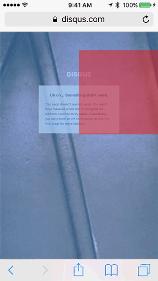
Take, for example, the awesome 404 page over at Disqus. They use a random animated GIF from popular TV and film, and it generally works well, until you hit the Han Solo scene.
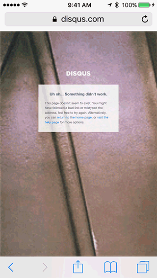
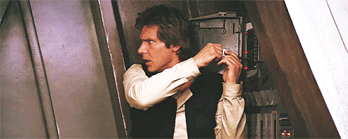
Uh oh, indeed. On closer inspection, Han can be found hiding beyond the viewport because the background image, shown in full below, has not been positioned and scaled appropriately for a mobile device.
While there are plenty of online resources describing how to center background images, I couldn’t find anything that would adaptively do so whilst keeping the background subject area into account. The JavaScript technique described here was first created for my home page, but I hope it may help others too.
Optimal positioning and scaling
First, some theory before we get into the code…
Since the viewport can be virtually any size and aspect, we need to constrain the position and scale of the background, keeping in mind:
- the location of the background image subject (e.g. Han Solo), and
- the page viewport target position (e.g. near the 404 message).
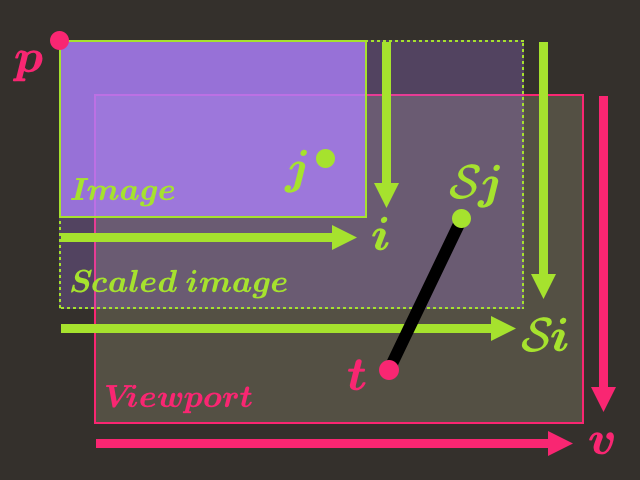
We can represent the image subject by the point and the viewport target position by . Let’s denote as the scale of the background image, and its position in the viewport as . The image position can be negative, which means that the image originates from the top-left, outside the viewport. Finally, denote as the viewport size and intrinsic image size. The units (other than scale) can be in pixels, or as we’ll see later, ems.
The problem is visualized below, where the aim is to find the the position and smallest scale so the scaled image covers the entire viewport .
We can write this down as an optimization problem
or in other words…
Minimize the squared distance between the viewport target and the background image subject, so long as the top-left corner of the image lies above and to the left of the viewport; and the bottom-right corner of the image lies below and to the right of the viewport. Do this minimization over the image position and smallest positive scale.
Looks complicated? It turns out there’s a relatively simple solution that doesn’t require any elaborate numerical techniques to implement.
General case
First, consider the general case where we assume the subject does not lie on the boundary of the image, or equivalently . (This will become clear shortly.)
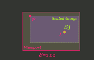
Now since the subject lies on the interior, we can choose an initial position arbitrarily so that the subject overlaps exactly with the target at some initial scale that is sufficiently small that the edges of the image do not hit the viewport boundary. It then follows that we can choose a new larger scale that enlarges the image just enough so that the entire viewport is covered. With these things in mind, we will satisfy all of the constraints of the original optimization problem. As the subject aligns with the target exactly, the minimization objective reduces to just the minimum scale (the squared distance is zero) and therefore the solution is optimal.
This is visualized in the animation below, where the optimal position and scale is achieved when the image covers the viewport on all four sides (shown with blue highlight). If the image is scaled up further, the viewport is still covered, but the minimization objective is always larger so it cannot be optimal. We will later show that this solution can be computed directly and without iteration as implied here.
The reason for the extra assumption on the boundary constraint is now clear: without it, we could not always place the image subject precisely over the target. For example, when (subject located in the top-left corner of the image) and (target located elsewhere), we would be forced to place the image at to satisfy the contraint so the image covers the top-left of the viewport. It cannot, therefore, be co-located with the viewport target . Special cases like these are discussed in the next subsection.
At this point we have reduced the optimization problem to a system of equations:
Rearranging in terms of and substituting into gives
This expression tells us what the minimum image scale needs to be so that the top-left of the image covers the viewport when the subject is positioned at the target.
Combining and gives,
Analgous to the above, this tells us the minimum image scale required for the bottom-right of the image to cover the viewport.
We can now combine the above constraints,
where we recognize that the scale is minimized when equal to the lower bound. Furthermore, this bound is always positive.
With that, we have the optimal scale value
and by substituting into , the optimal image position
Special cases
When the image subject lies on the boundary (, , , or ), the general case above doesn’t apply; see that blows up due to division by zero.
These special cases are avoided in practice as it’s easy to ensure the subject avoids the boundary.
To deal with it nevertheless, it can be shown that we need to “pin” the image edge corresponding to the boundary dimension. For example, if then the image will be pinned to the left with . The solution for and can be derived with a new optimization problem analogous to the previous development, with fixed. The final solution is similar to - but where the pinned constraint is omitted.
To see this, consider most trivial special case where the image subject is at : here the image must be positioned at the origin of the viewport to satisfy , no matter where the target is, with the scale chosen to be an aspect-preserving viewport “cover” to satisfy the other constraint . The squared distance in the minimization objective is no-longer zero, but still reaches the minimum.
We leave the detailed solution as an exercise for the reader.
Working with regions
Our problem setup has assumed that the subject of the background image and viewport target were each a single point. It is more natural to define a subject region and target region instead.
Having defined bounding boxes for each region, we can sensibly map them to points by taking their centroids. They can then be used to compute the optimal position and scale as before. We take this approach in JavaScript below.
Limiting the viewport size
Should the aspect ratio of the viewport become very large (e.g. a super wide display), then the image scale might also become so large that the subject area becomes obscured outside of the viewport.
We can deal with this by defining a “virtual viewport”
that is used in lieu of the regular viewport dimenions, with the aspect ratio of clamped to a given maximum in either direction. That is, ultra-wide viewports are clamped in the -direction so that the aspect ratio is fixed to the maximum; and similarly for ultra-tall viewports. The virtual viewport size can then be used in lieu of above to compute an aspect-constrained optimal position and scale.
JavaScript implementation
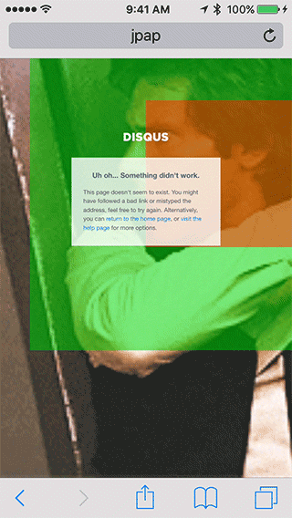
We’ve recreated the Disqus 404 page, so that we can test out the technique. The complete source code, including HTML and CSS not shown here, is available on GitHub.
The goal is to position Han Solo at the top-right of the 404 message, as shown in red below.
Let’s write JavaScript to:
- Define the background image dimension and subject,
- Determine the aspect-ratio constrained viewport and define a target region for placement of the subject, and
- Compute the optimal image scale and position, before applying it to the background image.
Image and subject
Choose the background image subject area to cover Han’s face and account for the slight camera movement, shown below in green.

The image dimensions and subject are compactly defined using simple objects:
// Image size
var imageSize = {
  w: 500, h: 200
};
// Image subject region
var subjectRegion = {
  x: 162, y: 4,
  w: 154, h: 144
};
Viewport and target
We use jQuery to determine the viewport size, constrained to an aspect ratio of 2:1. The target region is defined using percentages on the viewport geometry:
// Clamp size to a maximum aspect ratio
function clampAspect(size, maxAspect) {
  var aspect = size.w / size.h;
  if (aspect > maxAspect) {
    size.w = size.h * maxAspect;
  }
  // Equivalent to if (aspect < (1.0 / maxAspect)),
  // where the ratio is reversed for the vertical.
  else if (aspect * maxAspect < 1.0) {
    // (We use a reversed ratio here too)
    size.h = size.w * maxAspect;
  }
  return size;
}

// Clamp viewport to 2:1 aspect
var viewportSize = clampAspect({
  w: $(window).innerWidth(),
  h: $(window).innerHeight()
}, 2.0);

// Viewport target region
var targetRegion = {
  x: 0.50 * viewportSize.w,
  y: 0.10 * viewportSize.h,
  w: 0.50 * viewportSize.w,
  h: 0.35 * viewportSize.h
};
Optimal Position and Scale
We first map regions onto centroids, then compute the optimal image scale and position using and respectively:
// Subject region centroid
var subject = {
  x: subjectRegion.x + (subjectRegion.w / 2),
  y: subjectRegion.y + (subjectRegion.h / 2)
};
// Target region centroid
var target = {
  x: targetRegion.x + (targetRegion.w / 2),
  y: targetRegion.y + (targetRegion.h / 2)
};

// Optimal image scale, Eq. (7)
var scale = Math.max(
  target.x / subject.x,
  target.y / subject.y,
  (viewportSize.w - target.x) / (imageSize.w - subject.x),
  (viewportSize.h - target.y) / (imageSize.h - subject.y)
);
// Optimal image position, Eq. (8)
var pos = {
  x: target.x - scale * subject.x,
  y: target.y - scale * subject.y
};
Now we must scale and position the image. To do this, we prefer em-units over pixel-units so that the background image stays put if a desktop user zooms the page.
// Position and scale the image with em-units
var emS = parseFloat(
  $("body").css("font-size")
);
$("#background-image").css({
  width: (imageSize.w * scale / emS) + 'em',
  height: (imageSize.h * scale / emS) + 'em',
  left: (pos.x / emS) + 'em',
  top: (pos.y / emS) + 'em'
});
With the above code placed into a function (not shown; see GitHub), we can call it on page-load to ensure the background is placed correctly, and register it as an event handler on the window resize event, so that the background adapts to viewport changes.
We now present Han Solo on a 404 page near you! Perfectly placed in every device orientation and every desktop browser window configuration. Try it out for yourself, or check out a JPEG still image example on my home page.
Questions? Drop a comment below.
If you enjoyed this post do share it with your friends and colleagues below and give me a shout on Twitter.